
Welcome to Friday Foto Flogging, a place to share your photos and photography news. We were inspired by the folks at European Tribune who post a regular Friday Photoblog series to try the same on this side of the virtual Atlantic. We also thought foto folks would enjoy seeing some other websites so each week we’ll introduce a different photo website.
This Week’s Theme: Shadows and/or reflections.
Website(s) of the Week: Igor Siwanowicz Bug Photography.
AndiF’s Shadows and Reflections
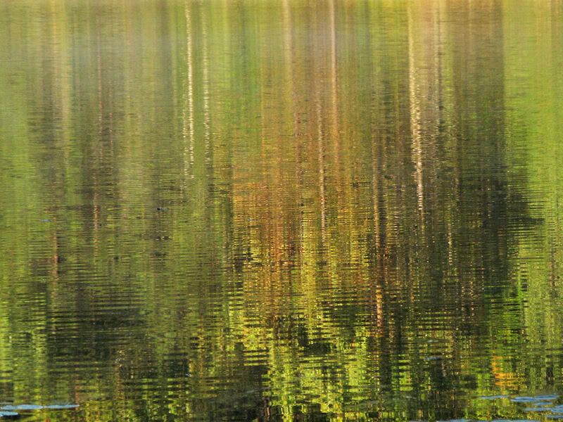 |
Melting Reflection
Click image for larger version |
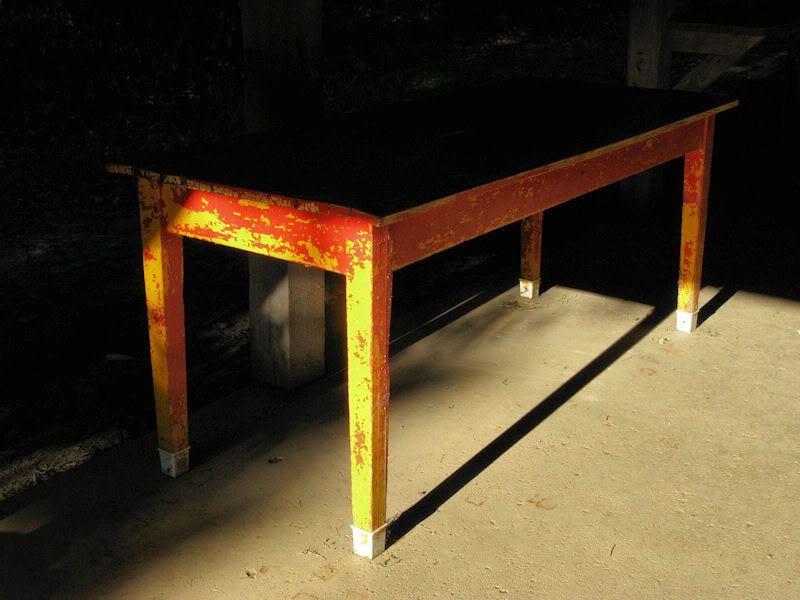 |
Sharp Shadow
Click image for larger version |
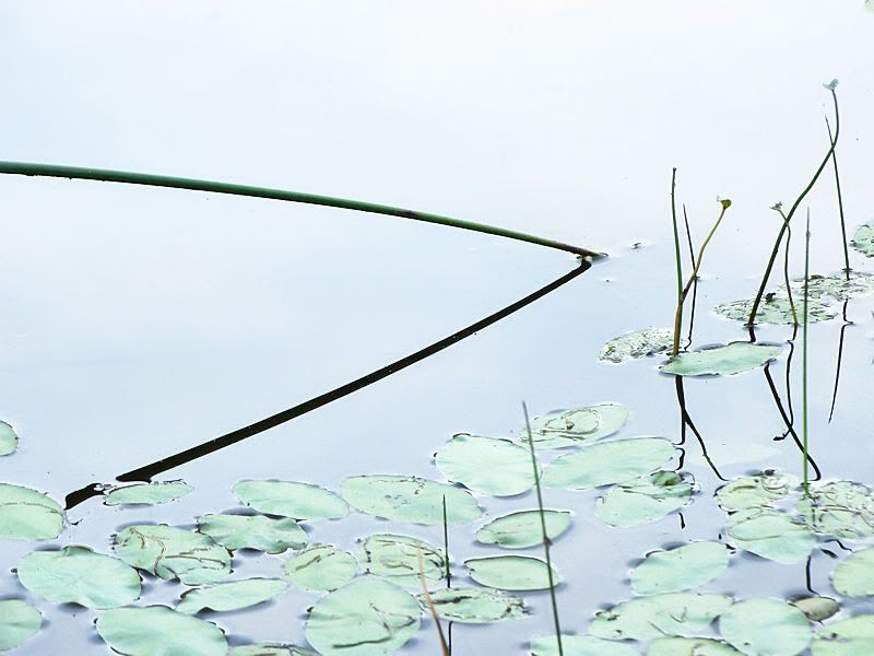 |
Shadowed Reflection
Click image for larger version |
olivia’s Shadows and Reflections
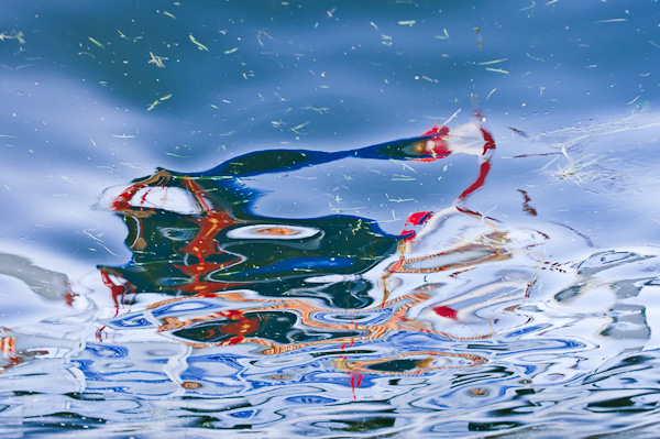 |
Chinese float
Click image for larger version |
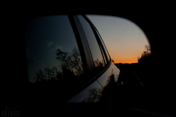 |
Sunrise side-view mirror reflection
Click image for larger version |
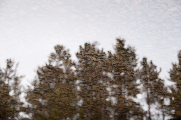 |
Rock trees
Click image for larger version |
Next Theme (Friday November 12, 2010): Random: Your choice.
Info on Posting Photos
When you post your photos, please keep the width at 500 or less for the sake of our Bootribers who are on dial-up. If you want to post clickable thumbnails but aren’t sure how, check out this diary:
Clickable Thumbnails. If you haven’t yet joined a photo-hosting site, here are some to consider: Photobucket, Flickr, ImageShack, and Picasa.
Previous Friday Foto Flogs

As we get close to my favorite holiday, Halloween, I look forward to seeing the theme become more and more present throughout the area I spend half my week – South Jersey. There are lots of haunted hayrides and haunted houses in the more rural areas and some of them are simply fantastic and on the PA side of things (the other half of my week), there are some haunted attractions that are nationally recognized as well.
Although I haven’t gone to one yet this year, I was out doing some wildlife photography when I stumbled upon a hayride setup and took some pictures of the props so let me post those and then move onto a bunch of my other recent shots from the same place.
Hopefully these don’t come out too dark. For some reason, the monitor at home has these images looking fantastic but on the monitor in front of me now, they come up very dark. Please let me know if they’re hard to view. Also, all images should be embedded so if you want to see them larger, just click them.
And that’s it for the Halloween stuff. Like I said, this started as some wildlife photography so let’s look at what I was shooting which ended up really being just one particular bird, a gorgeous heron.
For now, all the pictures will be from the same place, a series of old bog iron mines that have since filled with water and are now stocked with fish for seasonal fishing and is part of a public nature park.
I’ll post some more a little later from a different area. There will be some color shots then.
though on second thought, I suppose one could argue that the first five shots are of things that hide in the shadows while the remainder of the shots have reflections already somewhat featured in them in one form or another.
These don’t really follow the theme but I wanted to share them with everyone.
Eating a freshly caught bass or catfish
This is a shot from the Philadelphia Zoo that I recently visited.
And this is a wild peacock running around by some woods in South Jersey.
Big momma snapper found crossing my parent’s street
Possibly young Osprey
Bald Eagle
And lastly, one of a bazillion frogs in my parent’s pond
Love all three sets (themes be damned) but I love the frog photo best (so maybe not damning the theme).
I love the frog too, and the snake just above. Love the green and blue hues in that one.
The funny thing about that shot was on that trip, I only went with my 35mm lens not thinking about needing reach to get some close-ups of animals farther back in their pens. A lot of wasted shots as a result of it.
I have to admit the frog one is one of my favorites as well! I didn’t expect it to come out as well as it did.
Hey ss — those are fantastic. Looks like you’ve been having fun. 🙂
I love the bw — what settings do you use for your bw?
I shoot in color and then desaturate to mono. From there, I may adjust the temperature cooler to really bring out and provide higher contrast between the blackest blacks and the whitest whites. It’s actually a technique I kind of discovered by accident. Sometimes it works, sometimes it doesn’t and sometimes I use it and sometimes I don’t.
But I like the effect it’s been having and I find it makes for much more remarkable black and white images. The biggest drawback so far – and it’s inconclusive at this point – is if it’s actually effective or no as when viewing finished images on the 22″ hi-def LCD on the computer at home has the images looking really striking in terms of dark/light contrast.
Then I get to work and look at the images and they appear much darker over the entire image on the standard LCD’s at work and I wonder if I’m overdoing it altogether. I suppose I should try to get a couple shots printed to see if it holds up in print.
Here’s another one that I desaturated. It looked great in color but doing it in mono creates a totally different emotional atmosphere. In the process, it lost a lot of foreground detail in the grass but I was comfortable losing that detail. I’m still not convinced I like it but I’m playing around with it.
Thanks for the detailed information. I’ve never had much success converting to bw — when I do attempt I usually just pull the saturation slider down and then try to fiddle with the whites and blacks but I’m sure I’m missing something b/c I’ve never been happy with them. I’ll have to play around with the colours and see what impact that has.
The viewing of images on different monitors is something I struggle with as well … It’s great to work on a calibrated monitor but then when you post them who knows how they appear to others. The difference on Mac and PC in my house is so great, you can hardly tell they are the same photo. And Andi knows all about this too, mostly because I complain about it to her all the time. 😉
I know people/photographers say that if you print them out and they look like they appear on your screen then success! But if you’re creating an online portfolio, how do you reconcile the differences? I spent a long time (like a good month) calibrating and processing and sending prints to the lab before I finally got them to look the same, but then they don’t look good online. So … I sort of gave up. At a minimum, I save my jpegs in sRGB before uploading and try to not think about it.
Just to demonstrate the difference once can achieve between two images, here’s a shot I took today. The color image had some additional saturation applied as well as some clarity and added sharpness.
However, the black and white version was desaturated, the temperature was lowered, the blacks were increased, the curves adjusted, the highlights & shadows tweaked, some vignette was added – the works. Whether someone might disagree that it’s even a photograph anymore and now an artistic or graphical work, in my opinion, it’s still rooted initially in photography and is processed in a way to produce what I see in my mind when I look at it.
The star-burst was the result of using a small aperture so I could fire the flash to better illuminate the undersides of the leaves.
To further answer your question, as for specific in-camera and actual shutter options, I shoot manual and will often take a variety of shots at different f-stops and shutter speeds and check my histogram (something I’ve been trying to do more often) to make sure I have a good peak of colors in the middle and that I’m not losing any (or too much) detail in the darkest and lightest areas of the shot.
Color setting in-camera is set to Vivid+ but that’s about as much as I can remember at the moment.
Similar images posted in the cafe a couple of years ago – can’t recall exactly which I did then.
They’re both very appealing but the glow of the fish really makes that shot stand out.
Hi ask — love the fish! The top with of the trees with the leaves is a great effect. The sprawling tree limbs are perfect for it.
Great flog last month!
That bottom photo is a great capture — just perfectly shot.
And the color and framing of the first photo is spectacular but I can’t decide what it is — I can’t tell what the statues are doing (baseball?).
Not to leave out the middle photo — I like the composition of it a lot.
Thanks Andi,
The top shot is the WW II Memorial in Bedford Va. The scene is soldiers storming the beaches of Normandy. Overlord was the name of the operation.
Hi Bob.
Beautiful colours in your top two — especially love the tones in the second (reminds me of film).
Agree with Andi on the third though — that is purrrrrfect. Just perfect. Love it. 🙂
Hi,
Thanks. Love the float shot. The second was shot with the D1x which has a reputation of making “film like” images.
The second was shot with the D1x which has a reputation of making “film like” images.
Interesting — love that soft look.
Not surprisingly, I call this photo, “Me and My Shadow”.
A little someone I picked up today on our walk.
Found two different orchids today, a Maroon-hood and a Pink Fingers. Will post pics tomorrow.
A tiny Pink fingers orchid (about half-an-inch across).

And the only Maroonhood thus far.

Tiny hints of glories yet to be.
So delicate and pretty!
Fantastic shot — it looks like it’s just about ready to tell its shadow to get lost; the world’s not big enough of the two of them.
Thanks. That was taken for a zoo photo competition – it came in second.
Hmpf – probably should have been a first (IMHO).
It’s nice to know who your friends are. 😉
I hear the theme to Alfred Hitchcock Presents when I look at this picture.
Wait till you meet one of our local plovers – we call them “Psycho Lapwings” for their tendency to charge people, pets and even cars – which is truly frightening because they have a long spur on their forward wing joint.
Gorgeous!
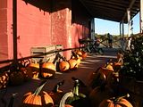
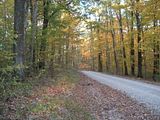
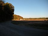
Today’s road trip to the orchard after work
Pumpkin shadows
A “road less traveled”
Harvest is in
Distant daylight
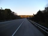
I really like the use of shadow and light in the harvest photo. Definitely my favorite with the parade of pumpkins a close second.
Hi ID. I love the bottom two, especially the leading road in distant daylight. The pumpkins are great too! 🙂
The first batch.
I`ll be posting more tomorrow.
SHADOW MOUNTAIN
SUNSET LURKERS
BLOOD REFLECTION
EXIT STAGE LEFT
Hard to pick a favorite between the gorgeous and startling Shadow Mountain and the gorgeous and joyous Sunset Lurkers — so I’m not going to.
Love shadow mountain – love the blue. Amazing sunsets. Gorgeous.
Olivia,
The sunset colors are the result of smoke from one of our infamous Southern California fires.
People often come down to the beach to watch the sunsets at times like these, hence the “Lurkers”.
A few reflections, click to enlarge.
Brasilia, Brazil:
Groningen, Netherlands:
Centre Pompidou, Metz, France:
Pirenopolis, Brazil:
Mannheim, Germany:
Lindau, Germany:
Mannheim, Germany:
Great set..tes taerG
Beautiful evocation of the theme. I’m in love with Groningen, Netherlands — I love all the patterns, at odds with each other but somehow in harmony as well.
Agreed. I’m giving Sven “Best Interpretation of Theme”.
Agree as well!
thanks, you guys, I appreciate it!
Sven, these are fantastic. Great eye you have. 🙂
I love the warmth of Groningen, Netherlands and the cool of Mannheim, Germany.
Gorgeous set!
Those are fantastic bug shots in the web link Andi – wow.