
Let’s get right to it, shall we? The following pie charts should be self-explanatory:
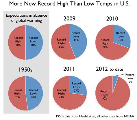
All things being equal regarding temperatures, one would expect 50% high records each year and 50% record lows. As you can see from the charts above the decade of the fifties came close to matching this expectation. Unfortunately, in the last four years that expectation (which assumes no change or minimal change to existing climate conditions) has not been met. Instead, we’ve seen a continuation of the trend of the last decade (2000-2009) where record highs exceeded record lows by a ratio of 2:1.
Over the last 30 years of global warming, the sun has shown a slight cooling trend. Sun and climate are going in opposite directions. This has led a number of scientists independently concluding that the sun cannot be the cause of recent global warming.
One of the most common and persistent climate myths is that the sun is the cause. This argument is made by cherry picking the data – showing past periods when sun and climate move together but ignoring the last few decades when the two diverge.
By the way if you think the sun has everything to do with the current uptick in record high temperatures – uh, not exactly:
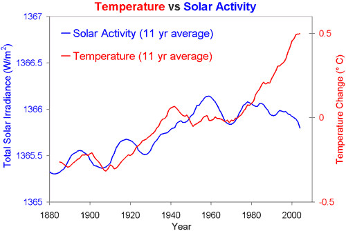
Obviously if the sun was to emit a lot more solar radiation that it currently generates, that would have an effect on our climate, but to claim that solar radiation is the sole reason climate is changing so rapidly, as opposed to human activity, is ridiculous on its face. If it were true that human actions, such as the vast increase in greenhouse gases emitted into our atmosphere over the last 150 years, had no impact on climate (specifically the increased warming of air sea and ground temperatures), we would have observed decreased temperatures over the last 30 years, not increased ones.
Indeed, the period of stable global temperatures during the fifties and sixties (i.e., the flattening of the trend of global warming) and in the Northeast of the US during the early nineties occurred at a time when air pollution and specifically high amounts of sulfur particulates were present in the atmosphere creating a cooling hole which delayed the warming effect of greenhouse gases — for a time:
Cambridge, Mass. – April 26, 2012 – Climate scientists at the Harvard School of Engineering and Applied Sciences (SEAS) have discovered that particulate pollution in the late 20th century created a “warming hole” over the eastern United States—that is, a cold patch where the effects of global warming were temporarily obscured.
While greenhouse gases like carbon dioxide and methane warm the Earth’s surface, tiny particles in the air can have the reverse effect on regional scales.
Unfortunately, the reduction in particulates has now demonstrated that the longer term trend of global warming was delayed over the Eastern US, not eliminated. Just ask anyone over the last several years who lives in regions where particulate pollution has diminished. Particulates in the atmosphere do not last as long as CO2 emissions, the primary greenhouse gas. and thus create only a short term effect on temperatures. Massive volcanic eruptions such as the the 1883 Krakatoa eruption can have a significant short influence on temperature trends because of the massive clouds of ash and other particulates they produce and send high into our atmosphere, but the effect is short lived. Indeed the cooling effect has become even shorter, as the equally massive 1991 Pinatubo eruption demonstrates:
An oceanic response to the 1991 Pinatubo eruption, which was comparable to Krakatoa in terms of its radiative forcing, has been identified in satellite altimetry data. The simulated heat-content recovery after Pinatubo seems to occur much more rapidly than for Krakatoa. This disparity arises because the Pinatubo response is superimposed on a non-stationary background of large and increasing greenhouse-gas forcing. The heat-content effects of Pinatubo and other eruptions in the late twentieth century are offset by the observed warming of the upper ocean, which is primarily due to anthropogenic influences.
Indeed, even NOAA is acknowledging that our recent 4 year period of increasing record setting high temperatures and extreme weather events (both record maximums during the day and record minimums during the night) is directly tied to anthropogenic influences on the earth’s climate:
Climate change researchers have been able to attribute recent examples of extreme weather to the effects of human activity on the planet’s climate systems for the first time, marking a major step forward in climate research.
The findings make it much more likely that we will soon – within the next few years – be able to discern whether the extremely wet and cold summer and spring so far experienced in the UK this year are attributable to human causes rather than luck, according to the researchers.
This is no joke, my friends, no grand hoax or conspiracy by climate scientists and Al Gore. We are witnessing irreversible changes to the earth’s climate as a result of our continued reliance on fossil fuels. We are past the point where we can stop the damage we are already experiencing. What we need to do is start planning ways to limit that damage as much as possible and adapt to the inevitable consequences of a warming climate: climate change refugees; war and National Security; food shortages and hunger, increased disease and pandemics; the extinction of species and loss of biodiversity; economic collapse; etc.
The longer we wait the less likely billions of human beings will survive the catastrophes to come, ones far worse than what we are experiencing now. Every night our US media ignores this issue, or when it does cover it, provides equal time to corporate funded climate deniers who spread lies and disinformation rather than address the mountains of data and evidence supporting the scientific consensus that climate change is real and the result primarily of human activity.
Perhaps this year’s record heat wave, wildfires in Colorado (and again in Russia), etc., will finally be the tipping point when Americans take this issue seriously and reject the lies of extremist Republicans, K Street lobbyists for Big oil, and the corporate sponsored propaganda campaign to deny what all but those who choose to be deliberately ignorant can see with their own eyes.
I sure hope so for my children’s sake, and yours.


And we who are paying attention here in the inter-mountain west now know that the past hundred years or so of our conquest have been an ahistorical period of unusually wet weather, that what we are now experiencing is a more historically accurate weather pattern, and that the drought will grow ever more severe.
Culling the herd…
Those pie charts are terrifying.
Unbelievable Charlatanism.
Haven’t you heard of the Urban Heat Island effect? In most cities, the average low temperatures have been rising due to the fact the concrete in the center of these cities, or at their corresponding airports, holds heat absorbed during the day, then releases that heat at night.
Go to any medium or large city–you’ll notice the low temperatures outside of the urban areas have low tempertures from 5 to 10 degrees cooler than the downtown or airport areas.
The Urban Heat Island effect does not effect high temperatures…there aren’t more record high temperatures, there are just fewer record low temperaturs due to the Urban Heat Island effect. Most temperature readings are taken in cities, after all.
The overall earth’ atmosphere has been cooling for the last 7 years.
You guys twist data, be it climate or taxation or whatever, to justify bigger government. Every single time.
Pathetic.
Citation of study?
.
Differentiating between rural and urban temperature reading and position of weather stations. There are many UHI studies, however my observation is that the climate change deniers use data from the southern hemisphere. This is an obvious trick as there is an imbalance between global warming effect from the northern and southern hemisphere. The northern hemisphere has increased in temperature because of its land mass. The earth has maintained a balance throughout the ages by positive or negative feedback to regulate its climate.
"But I will not let myself be reduced to silence."So why did NOAA just say we’ve had the hottest past 12 months on record?
Hottest past 12 months for which geographical area? The United States? Or the planet? Europe had a record cold winter in 2011-12.
As for citiations, start with this one (I wish I could do the green print thing):
http://notrickszone.com/2011/01/22/signs-of-strengthening-global-colling/
The NOAA data is for the entire planet.
and you link is broken
.
"But I will not let myself be reduced to silence."Thinking about this further, urban heat islands store heat which they release more slowly than areas that are not urban heat islands. For record lows and highs, that would mean that there would be a geographical as well as time-series divergence of high and low temperature records, with the areas that are not heat islands having high and low temperature records closer to the 50%-50% breakdown. Does the data show this? Has anyone studied this possibility yet?
And urban heat island contribution to global warming would be anthropogenic global climate change.
Are there models of climate that incorporate both urban heat island effects and greenhouse gas effects to evaluate against real trends? It seems to me that urban heat islands could accelerate global climate change under greenhouse gas conditions as more and more land area gets turned into urban heat islands from urbanization storing more of the trapped heat and releasing it later.
Uhhmmm… Jane, not only is it two thousand and twelve (2012), not nineteen sixtie-six (1966) but of the forty-five hundred (4,500) record high temps recorded across the nation last month only ninety-six (96) of them were in “cities”.
‘S Ok though, I don’t hold it against you. You can’t help what you are and your inability to adapt enhances my grandchildren’s chances of survival.
Jane is a new user as if 7/11/2011.
She has three comments, two in this diary and one in BooMan’s “You are Not Taxed Enough Diary.” Based on her comments she appears to either be a paid operative of some right wing organization or a person who hates taxes and doesn’t believe in climate change no matter how many scientists say it exists and thinks rich people pay too many taxes enough to come here to a left center blog to make spurious and ludicrous arguments. I’m guessing the former, since her responses read like talking points.
The Urban Heat Island objection by climate change deniers to the data showing global warming is one of the oldest around and has been debunked numerous times.
A few links links:
http://www.realclimate.org/wiki/index.php?title=Myth:_Warming_is_due_to_the_Urban_Heat_Island_effect
http://www.realclimate.org/index.php/archives/2007/07/no-man-is-an-urban-heat-island/
It’s even been debunked by the scientists hired by the Koch brothers to prove the data supporting global warming is false or misleading.
http://desmogblog.com/urban-heat-island-favorite-skeptic-myth-debunked-again-time-koch-funded-scienc
e
In other words Jane is beating a zombie lie.
jane sounds suspiciously like the latest reincarnation of liberty for all or his last known alias, arturo gilroy.
definitely a troll, paid or not…do not feed.
There are some statistical traps in the pie charts. The expected value “The 1950s” sounds like it’s an average over all years in the 1950s. An average is not comparable to a single year unless you know the variation in the data points that make up the average.
The underlying data points for each year are, I assume, a count of the number of record high temperatures and record low temperatures of all weather stations in the US. So the 1950’s expected value is the average of those two data points for over the ten years in the decade. Presumably, the cited study also calculated the variance or the standard deviation of the distribution of data points, or both.
Then the question is whether the significant differences observed in 2009, 2010, 2011, and to date in 2012 can be explained as non-random against the data for 1950. Which requires looking at the standard deviation of the 1950 data and the numbers for the 2009, 2010, 2011, and 2012 data. Are the number of record highs and record lows in 2009, 2010, 2011, and 2012 excluded from being explained as random events?
The other thing that is worrisome is the use of partial data for 2012. It sweeps under the carpet the possibility that the number of record highs and lows in the remainder of the year might be more aligned with 1950, when tallied at the end of the year.
Climate deniers can and do play fast and loose with statistics, which is why we mustn’t.
That said, at a minimum the pie charts are suggestive.
Following the link back to the Skeptical Science article, I find Figure 1 to be very interesting. Aside from a better visual for the divergence in the number of record highs from record lows, there has also been a reduction in the total number of record temperatures as compared to the year 1950.
.
Cross-posted from my recent diary – Drill Baby Drill and A Global Warning
"But I will not let myself be reduced to silence."I don’t think this is the best way to make the case for globabl warming.
The assumption that you start with — that in the absence of global warming, you would expect a 50/50 blue/red pie — seems incorrect to me. Given a 150-year or so temperature record, you would expect both record highs and lows to be rare occurrences. If there aren’t a lot of either highs or lows, you wouldn’t expect the data to fall into a nice pattern.
On the other hand, the chance that there will be a record high in a given location on a given day will be much greater if there were a record high recorded that day 50 miles away, or if there were a record high at that location on the previous day. So, when there is a strong extreme weather system, you would expect there to be a large clustering of the record-breaking events. This would mean that one side of the pie would be a lot bigger.
If you take a long enough time frame, then, in the absence of global warming, you would expect an even split. But looking at three 1-year pies (one of which is pretty close to 50/50 actually) and one 6-month pie can’t really tell you very much about global warming.
It sure feel hot, though.
OK, I looked at the graphs accompanying the press release at the link, and I disagree with what I wrote above.
There are tens of thousands of record high/low readings annually in the U.S., which is more than I had imagined, so my first objection isn’t valid.
The data for a 2:1 division of the pie extend over the entire decade of the 2000s, so my objection about clusterings skewing the data for small timescales doesn’t seem very strong either.
Never mind.